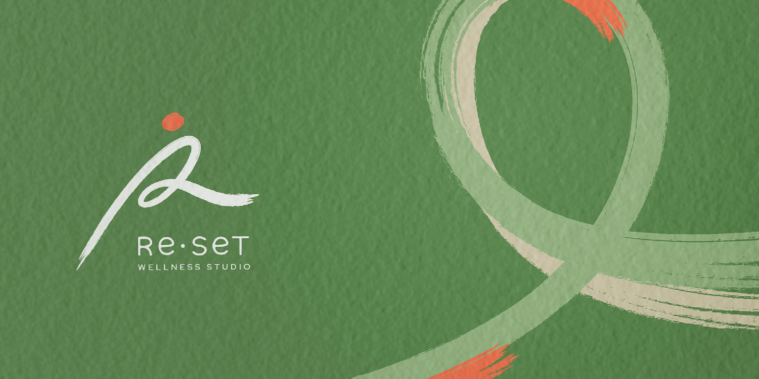
Creating a fluid and dynamic identity for a wellness studio
Health is a vital asset for everyone. Reset Studio supports better well-being for people of all ages, especially middle-aged audiences, through Pilates and Gyrotonic coaching.
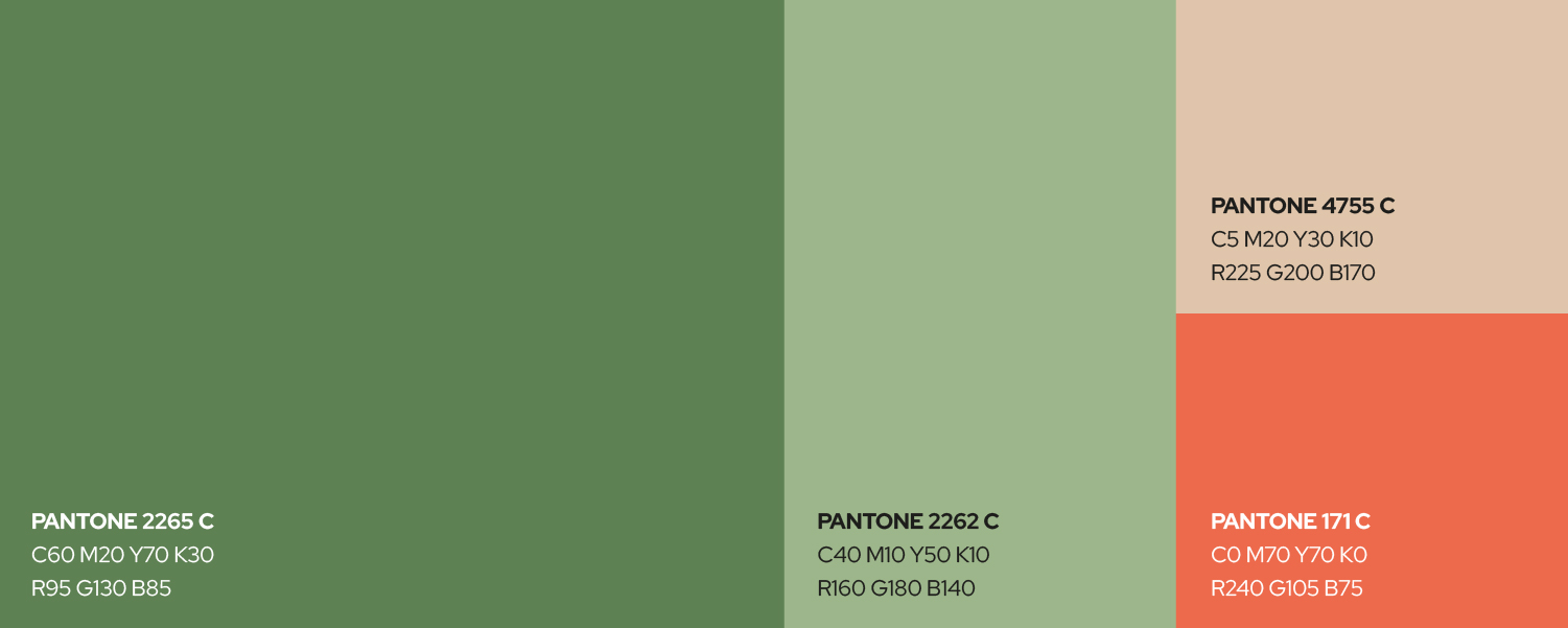
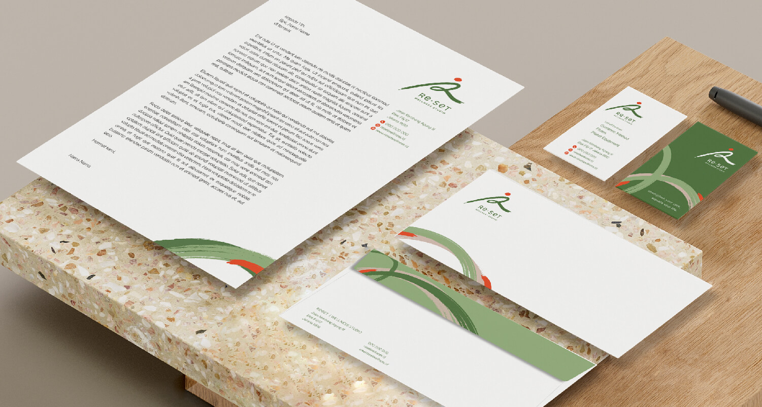
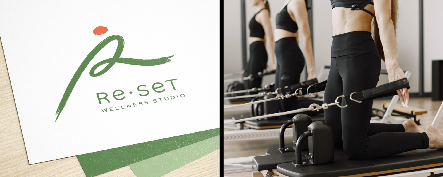
To introduce this new brand, we developed its full visual identity, from the logo to communication materials. The logo is derived from the letter R, the brand name's initial. This basic letter was then abstracted into a more flexible shape and drawn with a freestyle brush stroke to represent the flexibility seen in Pilates and Gyrotonic movements. An earth-tone palette brings calm and balance, while a vibrant orange accent adds energy and a sense of active motion.
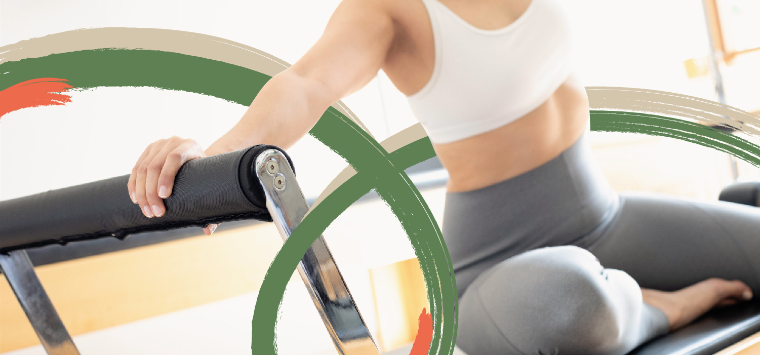
We extended this approach into a key visual derived from the logo, using bold, free-flowing strokes to emphasize motion and fluidity.
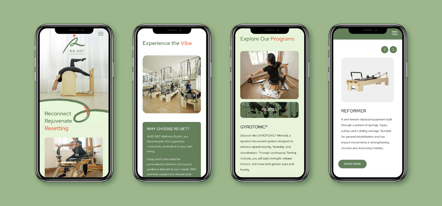
The identity carries through to the brand communications, including the landing page. With only one page available, it was important to simplify the brand's message so it could easily be understood in a short time. Structured sections for the overview, programs, facilities, and equipment, paired with representative photography, present all key information within a few scrolls and guide visitors to explore the brand further.