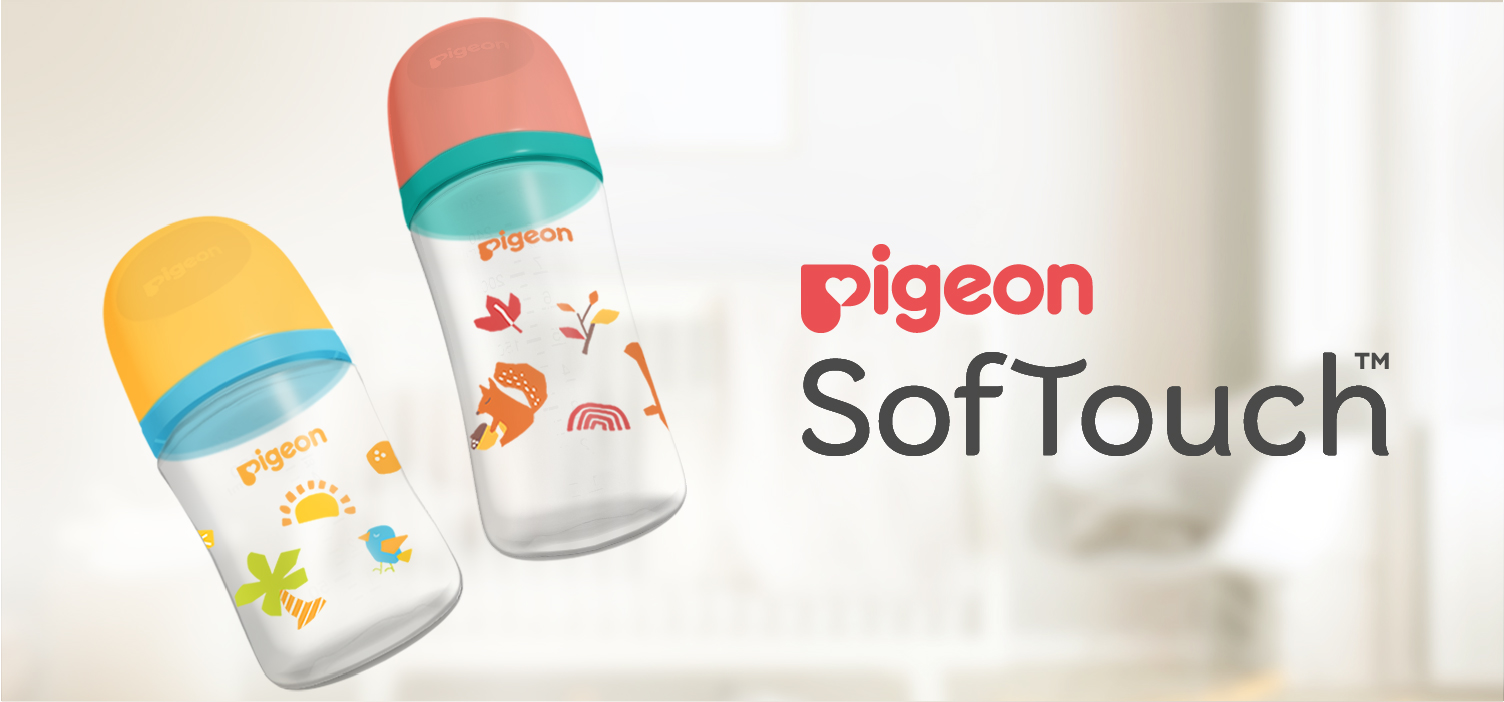
Elevating baby bottle design through nature
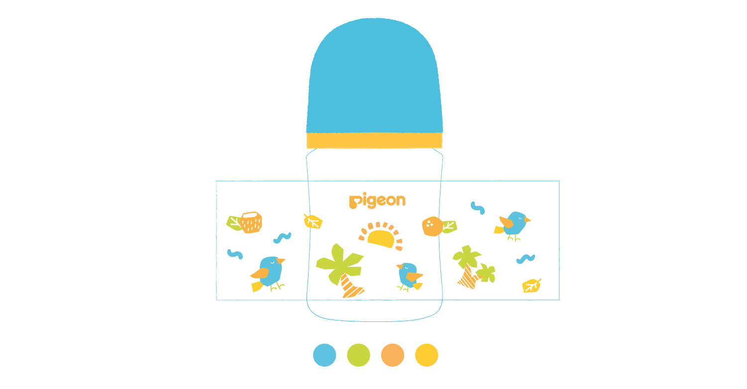
As part of the rebranding of Pigeon SofTouch Singapore, we created a new visual direction for the PP bottle range to elevate shelf presence and distinguish the products from the existing lineup. Inspired by the "Back to Nature" theme, the artwork translated the brand's sustainability efforts into a modern and engaging visual experience. By combining organic forms, playful compositions, and a clean contemporary aesthetic, the designs communicate both environmental responsibility and the warmth of modern parenthood.
Following an extensive design exploration, the final direction evolved into a Four Seasons concept, celebrating the beauty of nature through Spring, Summer, Autumn, and Winter. Our challenge was to create a cohesive visual system that captured the unique character of each season while maintaining consistency across the collection. Through a unified illustration style, shared graphic language, and carefully curated color palettes, each bottle expresses its own seasonal personality while remaining part of the same SofTouch series.
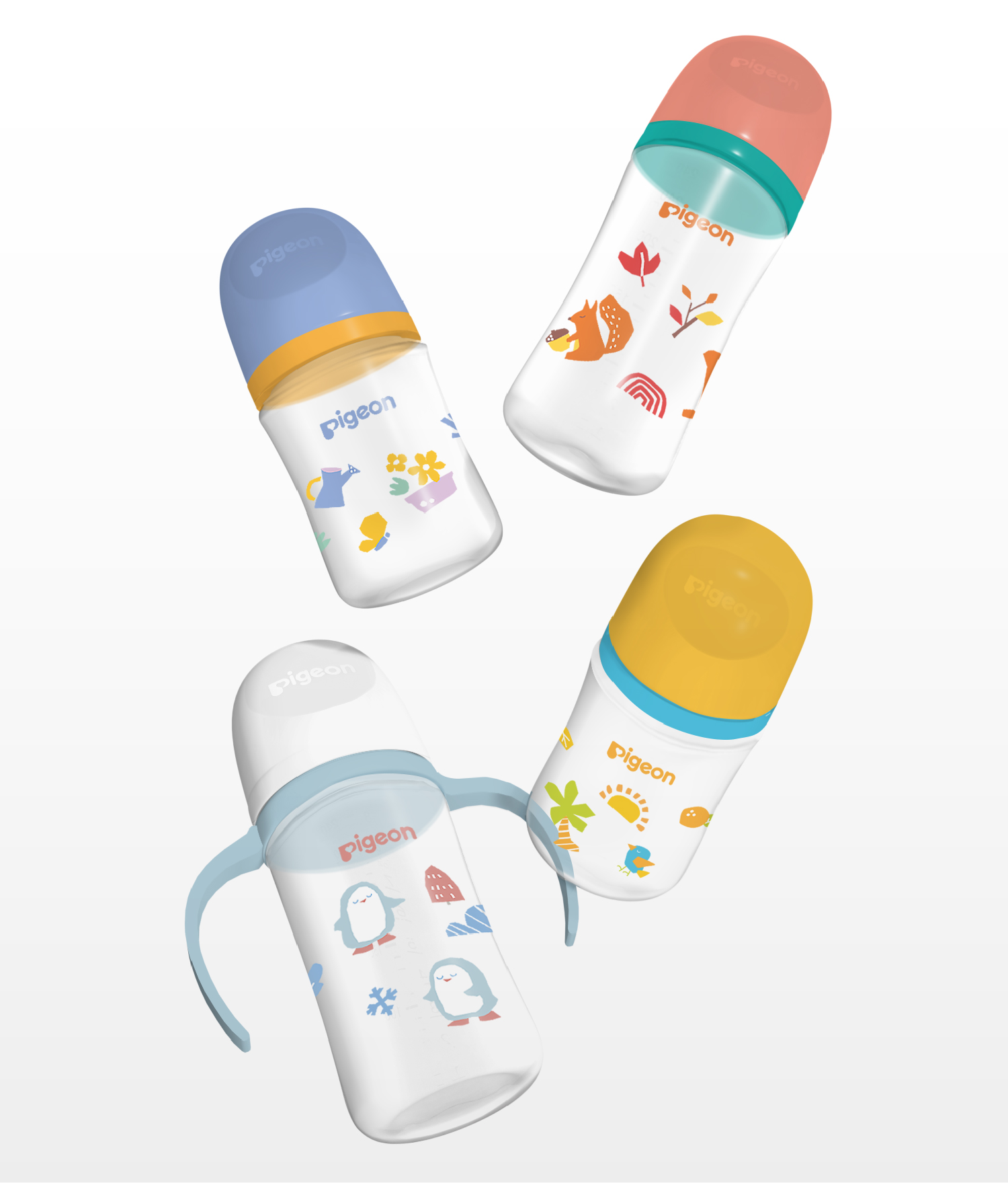
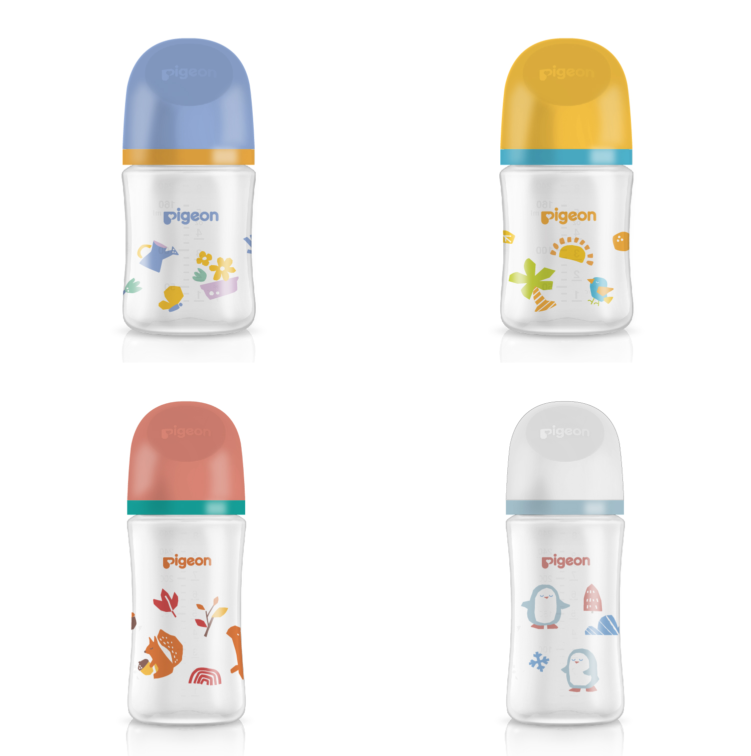
Working within the technical constraints of bottle printing, the illustrations were carefully developed using a limited color palette while preserving depth, character, and visual distinction across the range. This required a thoughtful balance between creative expression and production feasibility, ensuring the designs remained vibrant and impactful without exceeding manufacturing limitations.
The result is a collection that feels approachable and joyful, capturing the wonder of the natural world while reinforcing Pigeon SofTouch's positioning as a modern premium brand for parents who value thoughtful design, quality, and sustainability throughout their parenting journey.